Using an ‘image sprite’ as a rollover image in a menu
An image sprite refers to a single image that combines two or more background images used within a web site. Typically, a sprite would combine background images that are used for symbols, buttons, icons and general decorative purposes. It would not include images that are used as variable or unique 'content', such as photographs or illustrative graphics.
Combining images into a sprite has the advantage of reducing the number of http requests from a web page to a server, which in turn aids the download of the page. Every image in used in a web page generates a separate request to the server. Combining background images into one image effectively reduces the number of http requests.
An image sprite can be employed to create a rollover image for use in a menu. Another method for creating a rollover is by using JavaScript and two images. The JavaScript enables one image to be swapped for another when the mouse is placed over the image. This requires that the page download the script and send two http requests to the server for the images.
Implementing a rollover with an image sprite removes the need for the JavaScript and reduces the http request to one. Both image versions can be included in one image. When using an image sprite, the correct part of the image to be displayed is controlled by the CSS, in particular the X and Y (left and top) values of the background-position property. For a rollover used as a link, the image view to be displayed when the mouse is over the image would be controlled by the a:hover style.
Examples of image sprites:
An interesting tool for generating sprites and analysing the use of background images in a web page: SpriteMe
Creating ‘rollover’ images for a menu from image sprites
The simplest method of using an image sprite is for a rollover image in a menu.
Overview
- Create an unordered list with links
- Create an image that includes both ‘states’ of the rollover; these are the mouse-out and mouse-over states
- Create a style that inserts the image sprite as a background image to the link
- Offset the sprite with background-position with the a:hover style
To follow through this tutorial you can download the images used in the example here
Step 1 - Set-up the list
- Create an unordered list with 3 list items.
- Give the <ul> an ID or class name as required and create a style to remove bullet points and indentation only.
To see how to do this click here. - Give each list item a link (a null link will do for the exercise i.e. #).
- Give each link a different ID or class name. This will make it possible to create a style for inserting the sprite as a background image.
- Place <span> tags around the text for the links. This will make it possible to create a style to hide this text.
The code for the example on this page looks like this:
<ul class="menu_1">
<li><a href="#" class="one"><span>one</span></a></li>
<li><a href="#" class="two"><span>two</span></a></li>
<li><a href="#" class="three"><span>three</span></a></li>
</ul>
Step 2 - CSS
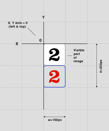
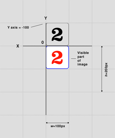
The following images show the image sprite, how it is used and therefore what x and y values to specify in the css.
Getting the image to appear
Create a style for the ID or class name for a link. This style specifies the sprite to be used and the space for the display of the image. The style for the first link in the example looks like this:
.menu_1 .one {
background-image: url(img/one.png);
background-repeat: no-repeat;
height: 100px;
width: 100px;
float: left;
}
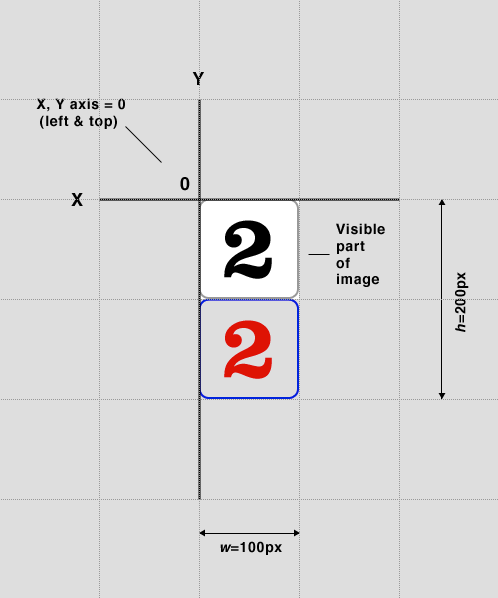
The default position of a background image is for the top left corner of the image to be aligned to the top left of the allocated space. Therefore, in this particular case, due to the way the sprite is constructed there is no need to specify the background-position (x y) of the sprite.
The float property places the list items inline and allows width and height values to be applied to the space. For vertical menus using this technique, use the display: block attribute instead.
Making the rollover
Create a style for the hover state of the link that will reposition the image when the mouse is placed over it. In this example the style looks like this:
.menu_1 .one:hover {
background-position: 0px -100px;
}
Here, a compound selector has been used to target the hover state of a link with the class name of one. The background-position alters the placement of the image by specifying -100px in the Y axis. This shifts the top edge of the image up to reveal the lower part.
Hiding link text
One more style is needed to complete the process - to hide the link text. The text is needed because it has the link attached, can be read by screen readers and will be visible if css is turned off. The reason for placing <span> tags around the text is so a compound selector can be created to hide this text, like so:
.menu_1 span {
display: none;
}
This will hide all text in the menu that is contained within <span> tags.
The full CSS
.menu_1 {
margin: 0px;
padding: 0px;
list-style-type: none;
}
.menu_1 .one {
background-image: url(img/one.png);
background-repeat: no-repeat;
height: 100px;
width: 100px;
float: left;
}
.menu_1 .two {
background-image: url(img/two.png);
background-repeat: no-repeat;
height: 100px;
width: 100px;
float: left;
}
.menu_1 .three {
background-image: url(img/three.png);
background-repeat: no-repeat;
height: 100px;
width: 100px;
float: left;
}
.menu_1 .one:hover, .menu_1 .two:hover, .menu_1 .three:hover {
background-position: 0px -100px;
}
.menu_1 span {
display: none;
}